
In classrooms, small businesses and community events across the country, the flyer — once the domain of graphic design software and, before that, the neighbourhood printing press — is quietly being redrawn by artificial intelligence. What used to take a designer several hours, and a novice several days of trial and error, can now be roughed out in minutes. The catch, as with most technological shortcuts, lies in the execution: an AI-made flyer that looks generic, borrows too liberally from existing work, or reads as unmistakably machine-generated defeats its own purpose. The challenge, then, is not simply to use AI, but to use it well.
Starting with intent, not the tool
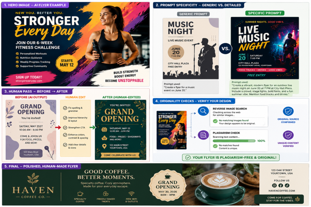
Designers who have adopted AI into their workflow point to a common early mistake: opening an image generator before deciding what the flyer needs to say. A flyer is, at its core, a piece of persuasion — an event, a sale, a workshop, a cause — compressed into a single glance. The most effective AI-assisted flyers begin the same way a good newspaper layout does: with a clear hierarchy of information — headline, date, venue, call to action — sketched out before any visual is generated. This planning stage also becomes the first line of defence against plagiarism, since a flyer built around the user’s own specific event details, tone and colour scheme is far less likely to echo an existing design than one built around a vague, generic prompt.
Writing prompts that avoid derivative output
AI image tools are trained on vast repositories of existing design work, and generic prompts — “poster for a college fest,” for instance — tend to pull from the most common, and therefore most repeated, visual tropes in that training data. This is where much of the unintentional similarity to existing flyers originates. Practitioners recommend prompts that are layered with specifics: the institution’s actual colour palette, the mood of the particular event, unusual compositional choices (asymmetry, negative space, an unexpected typographic treatment) rather than centred title-and-photo templates. The more particular the brief given to the AI, the further the output drifts from whatever it has seen most often — and the closer it comes to something genuinely original.
The human pass: editing, not just generating
No AI-generated flyer, however well prompted, should go out exactly as produced. Designers who treat the AI output as a first draft — rather than a finished product — consistently produce work that reads as more credible and more human. This typically involves three edits: correcting or replacing AI-garbled text (a well-documented weakness of image generators), adjusting colours and fonts to match an organisation’s actual branding, and manually repositioning elements so the layout does not carry the faint, symmetrical “AI look” that many viewers have now learnt to recognise. It is this final layer of human judgement — knowing what looks authentic and what looks synthetic — that AI cannot yet reliably supply on its own.
Checking for originality before publishing
Given how easily image generators can inadvertently reproduce elements of existing copyrighted work, a verification step is increasingly considered essential rather than optional. Reverse image searches, plagiarism-detection tools built for visual content, and a simple comparative scan against well-known templates in the same category can catch overlaps before they become embarrassments — or legal complications. This is particularly relevant for institutional and commercial flyers, where reputational and copyright risk is higher than in casual, personal use.
A tool, not a replacement
What emerges from conversations with designers and communication professionals is a consensus that AI is best understood as an accelerant for ideation, not a substitute for design judgement. It can generate ten visual directions in the time a person might sketch one; it cannot, on its own, decide which of those directions genuinely serves the message, the audience, or the brand. The flyers that succeed — that look considered, original and human — are, almost without exception, the ones where a human being made the final calls: on wording, on colour, on what stays and what is discarded.
As with many AI applications finding their footing in everyday creative work, the technology’s real value lies not in removing the person from the process, but in giving them more time to spend on the decisions that still require one.